
Reading your prescription label shouldn’t be a guessing game. For millions of people with low vision, standard pharmacy labels are too small, too faint, or too cluttered to read-even with glasses. The result? People take the wrong pill, the wrong dose, or miss refills entirely. It’s not just inconvenient. It’s dangerous. In fact, studies show that over 67% of visually impaired medication users have made at least one serious medication error because they couldn’t read their label. The good news? Solutions exist, and they’re more available than ever.
Why Standard Prescription Labels Don’t Work for Low Vision
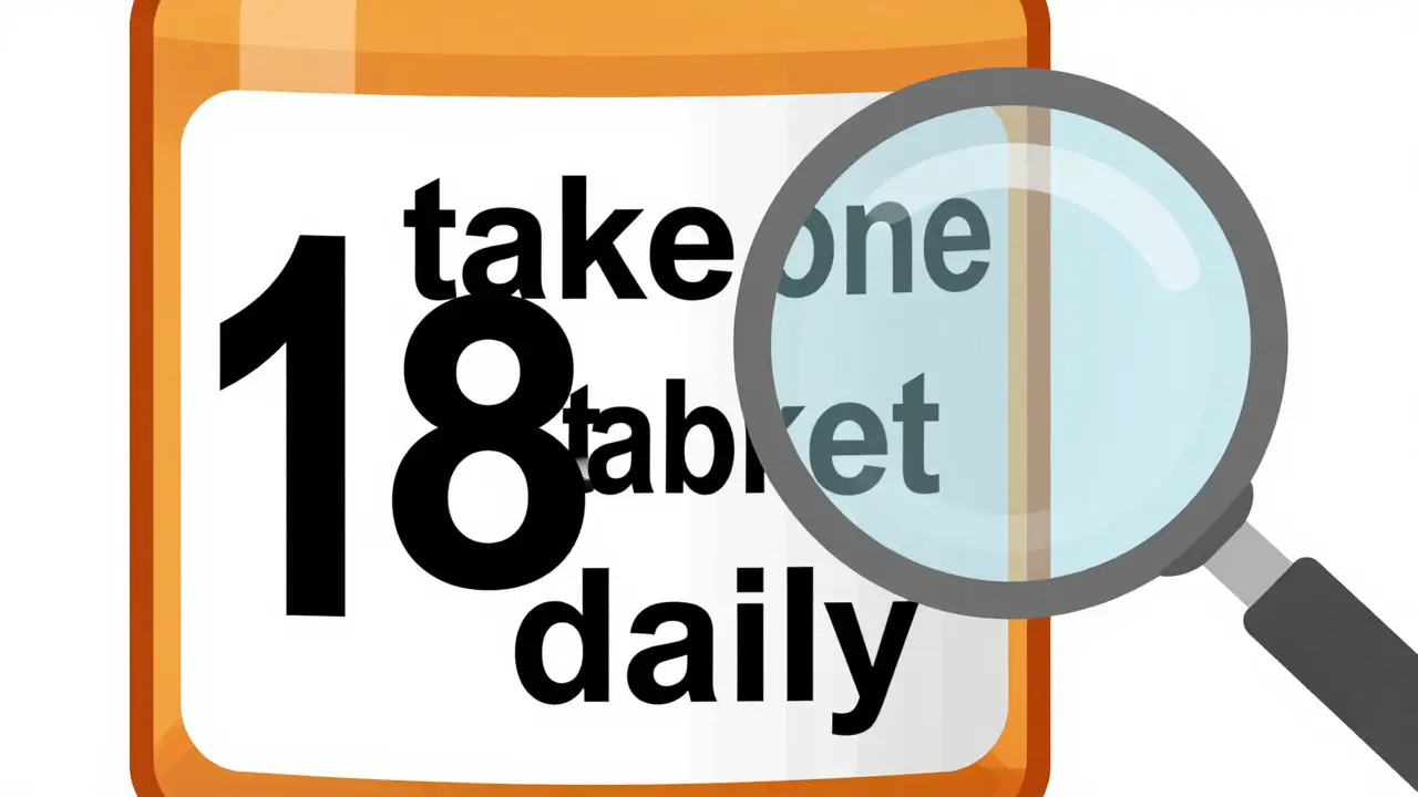
Most pharmacy labels are printed in 8- to 10-point font. That’s about the size of a tiny dot on a screen. For someone with macular degeneration, glaucoma, or diabetic retinopathy, even 12-point text can be unreadable. A 2021 CDC survey found that 20% of adults aged 45 and older struggle to read standard prescription labels. That’s nearly 1 in 5 people. And it’s not just about age-low vision can affect anyone at any time due to injury, disease, or genetic conditions. The problem isn’t just size. It’s contrast, layout, and font choice. Many labels use light gray text on white, or serif fonts like Times New Roman that blur together. Instructions like “take one tablet by mouth twice daily” are crammed into a space meant for a barcode. No wonder people rely on family members, caregivers, or apps to read them. But what if you’re alone? What if it’s 2 a.m. and you need to take your blood pressure pill?What Counts as Large Print? The 18-Point Rule
The American Foundation for the Blind (AFB) and the Access Board agree: for a label to be truly usable, it needs to be at least 18-point font. That’s more than double the size of a typical pharmacy label. Fonts like Arial, Verdana, or APHont™ (a free font designed specifically for low vision readers) are recommended because they’re clean, sans-serif, and easy to distinguish. The label should use high contrast: solid black text on a white background. No grays. No patterns. No glare. The text should be left-aligned, with all instructions in lowercase letters except for numbers (like “2” or “3”), which should be uppercase for clarity. Some labels use yellow highlighting to draw attention to critical info like “Take with food” or “May cause drowsiness.” Here’s the catch: a standard prescription bottle doesn’t have enough space for 18-point text and all the required info-name, dosage, instructions, warnings, refill details. That’s why most pharmacies now use a “duplicate label” system. They print the full label in large print on a separate piece of paper and stick it next to the original. Some even use color-coded stickers to match the large print label with the bottle.More Than Just Print: Audible and Digital Options
Not everyone can read large print-even 18-point. That’s where technology steps in. ScripTalk is one of the most widely used systems. It uses RFID chips embedded in the label. When you hold a small, handheld reader near the bottle, it speaks the full label aloud: “Lisinopril 10 mg. Take one tablet by mouth once daily. Do not take if pregnant.” The reader costs about $150, but many pharmacies provide them for free if you’re enrolled in their program. CVS, Walgreens, and Walmart all offer ScripTalk at most locations. Another option is QR code labels. UK HealthCare’s ScriptView system, for example, lets you scan the code with your phone and hear an audio version of the label. Some systems even let you adjust the voice speed or language. No extra device needed-just your smartphone. There’s also Be My Eyes, an app that connects you live with a volunteer via video call. You point your phone at the label, and someone on the other end reads it to you in real time. It’s free, works anywhere, and processed over 1.2 million label reads in 2023 alone.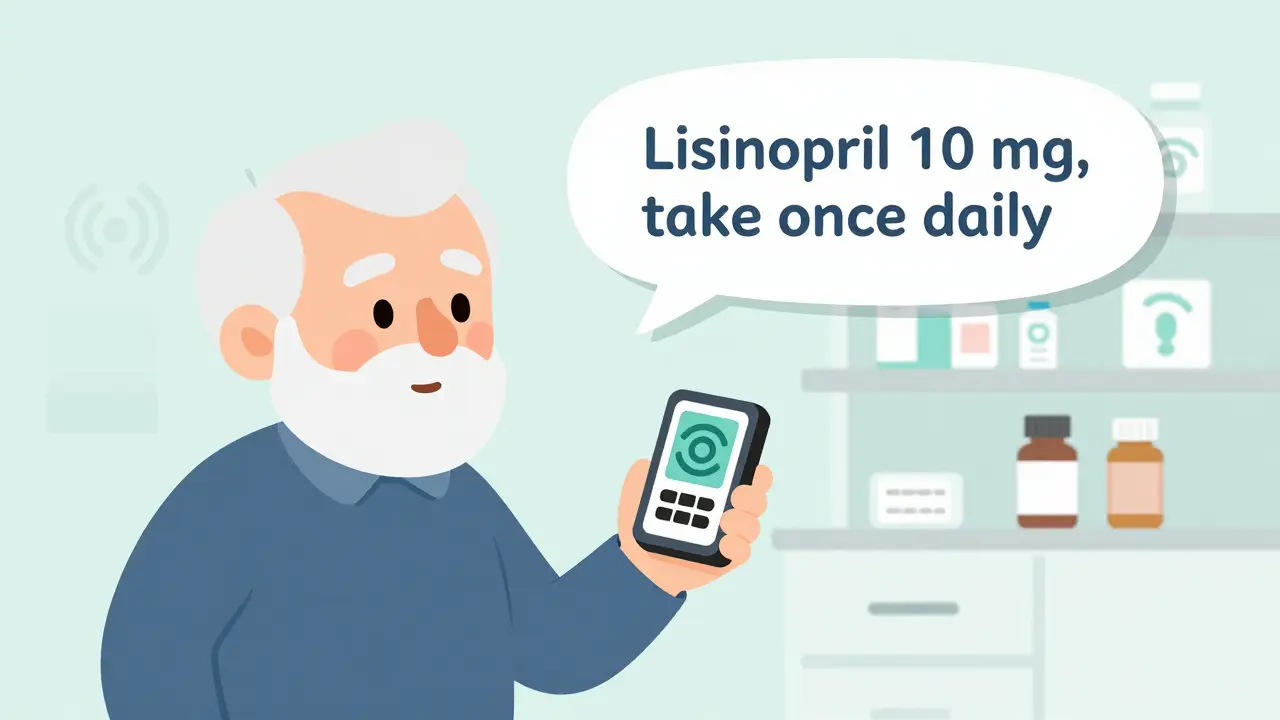
Braille Labels: Useful, But Not for Everyone
Braille labels sound like the perfect solution-but they’re only helpful to about 10% of people with low vision. That’s because most people who are blind learned to read braille as children. Many older adults who lose vision later in life never learned it. Even if they did, braille labels take up a lot of space and require special printers most pharmacies don’t have. They’re also not useful for people with low vision who still have some sight. For them, large print is far more practical.What Pharmacies Offer (And What They Don’t)
Major chains like CVS, Walgreens, and Walmart have made accessible labels standard. As of 2023, 98% of CVS locations, 95% of Walgreens, and 92% of Walmart pharmacies offer at least one option: large print, ScripTalk, or QR codes. Many of these services are free. You don’t need insurance. You don’t need to sign up for a program. Just ask. But here’s the problem: pharmacists don’t always know about these options. A 2023 review of 1,247 patient ratings on Healthgrades found that 37% of negative experiences came from staff who said, “We don’t offer that,” or “I’ve never heard of it.” That’s not a tech issue-it’s a training issue. Independent pharmacies are lagging. Only about 52% offer any accessible labeling, compared to 78% of hospital pharmacies. Many don’t have the budget for RFID readers or the training for staff. But they’re legally required to provide reasonable accommodations under the Americans with Disabilities Act. If your local pharmacy says no, you have the right to ask again-and if they still refuse, you can file a complaint with the Department of Justice.How to Get Accessible Labels: A Simple 4-Step Process
1. Ask. When you pick up your prescription, say: “Do you offer large print or audible prescription labels?” Don’t wait for them to offer it. Be direct. 2. Specify your need. Tell them what works for you: “I need 18-point font,” or “I’d like a ScripTalk reader,” or “Can I get a QR code label?” The more specific you are, the easier it is for them to help. 3. Ask for a duplicate label. If they only have small print, ask if they can print a second, larger copy and stick it to the bottle. Most can do this with standard printers. 4. Follow up. If they say no, ask to speak to the pharmacist in charge. If they still refuse, contact the pharmacy’s corporate office or file a complaint with the ADA. You’re not asking for a favor-you’re asking for your legal right to safely take your medication.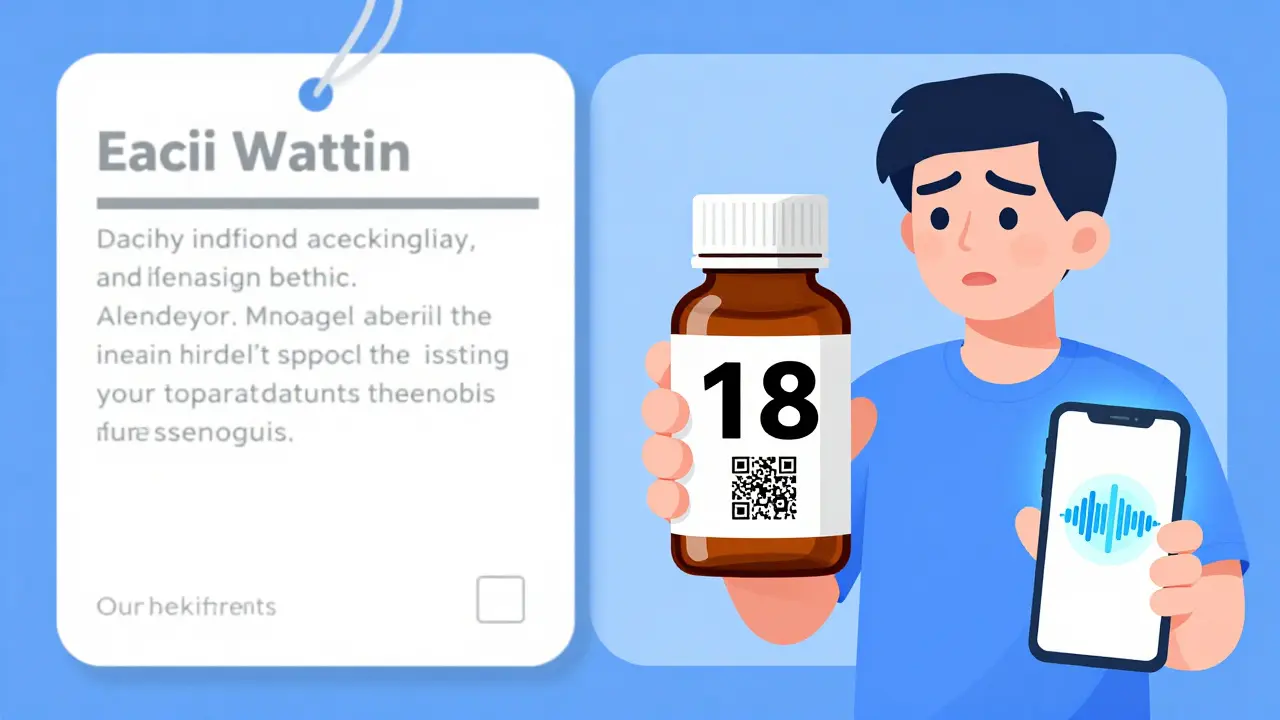
Real People, Real Results
One 78-year-old woman in Kentucky, living with diabetic retinopathy, used to mix up her insulin and metformin. She’d take the wrong one, then end up in the ER. After switching to ScriptView large print labels with audio support, her hypoglycemic episodes dropped by 75%. She now manages her own meds without help. A Reddit user named VisionLiberation posted in March 2023: “Since my pharmacy started offering 18-point Arial labels, I’ve stopped taking the wrong pills twice a week. It’s literally life-changing.” These aren’t rare stories. A 2022 survey by the American Council of the Blind found that 82% of users improved their medication adherence after switching to accessible labels. That means more people are taking their meds correctly-and fewer are ending up in hospitals.What’s Coming Next
By 2026, the FDA plans to require accessible labels on all electronic prescriptions and patient portals. That means if you get your meds through a mail-order pharmacy or online refill system, the digital version will also need to be readable by screen readers and adjustable in font size. AI tools are getting smarter too. Apps like Be My Eyes are integrating with pharmacy systems so your label info can be pre-loaded into the app before you even pick up your prescription. Imagine walking into the pharmacy, pulling up your phone, and seeing your label already displayed in 24-point font-no scanning, no waiting. The market for accessible labeling is growing fast. It was worth $3.2 billion in 2022 and is projected to hit $5.7 billion by 2027. That’s because more people are living longer with vision loss-and they’re demanding better.Final Thoughts: You Have the Right to Read Your Labels
Accessible prescription labels aren’t a luxury. They’re a necessity. They’re not just about convenience-they’re about safety, dignity, and independence. You shouldn’t need to beg for a label you can read. You shouldn’t need to rely on someone else to tell you what’s in your pill bottle. If you or someone you care about has low vision, ask for large print or audible labels today. If your pharmacy says no, ask again. And if they still say no, know that you’re not alone-and you’re not wrong. Millions of people are doing the same thing. And change is happening, one label at a time.What font size should a large print prescription label be?
A large print prescription label should be at least 18-point font, according to the American Foundation for the Blind and the Access Board. This size is proven to be readable for most people with low vision. Standard pharmacy labels are typically 8-10 point, which is too small for many users.
Are large print prescription labels free?
Yes, in most cases. Major pharmacy chains like CVS, Walgreens, and Walmart offer large print, audible (ScripTalk), and QR code labels at no extra cost. You don’t need insurance or a special program-just ask the pharmacist.
Can I get a large print label for my mail-order prescriptions?
Yes. Most mail-order pharmacies offer large print labels upon request. Some also provide audio versions or digital access through their patient portals. Contact customer service and ask specifically for an accessible label format.
What if my pharmacy says they don’t offer accessible labels?
Under the Americans with Disabilities Act, pharmacies must provide reasonable accommodations for people with disabilities-including accessible prescription labels. If your pharmacy refuses, ask to speak to a manager. If they still refuse, you can file a complaint with the Department of Justice. Many pharmacies only need to be reminded of their legal obligation.
Is braille the best option for low vision?
No. Braille is only useful for the 10% of visually impaired people who learned it early in life. Most people who lose vision later in life can’t read braille. Large print and audible labels are far more practical and widely used. Braille labels also require special equipment and take up more space, making them less common in pharmacies.
How do I know if a label is properly designed for low vision?
A well-designed label uses 18-point or larger sans-serif font (like Arial or APHont), black text on a white background, no glare, left-aligned text, lowercase letters (except numbers), and clear separation of drug name, dosage, and instructions. Avoid labels with gray text, small fonts, or cluttered layouts.
 Medications


dean du plessis
December 28, 2025 AT 08:21Been using large print labels for my dad since his glaucoma got worse. Simple change, huge difference. He finally stopped mixing up his blood pressure meds. No drama, no tech, just bigger letters. Why isn’t this standard everywhere?
Caitlin Foster
December 29, 2025 AT 16:26OH MY GOD YES!! I’ve been screaming this from the rooftops since 2021!! My grandma was almost hospitalized because she thought ‘10mg’ was ‘100mg’ on a tiny label!! Pharmacies are literally playing Russian roulette with people’s lives and they act like it’s no big deal??!?!!?!!?!!
Elizabeth Alvarez
December 30, 2025 AT 07:53Let me tell you what they’re not telling you. Big Pharma doesn’t want you reading your own labels. Why? Because if you knew what was really in those pills-fillers, dyes, undisclosed allergens-you’d stop taking them. The FDA? They’re in bed with the pharmacy chains. Large print? It’s a distraction. A placebo for control. They don’t want you independent. They want you dependent. And the QR codes? They’re tracking your medication habits. Every scan. Every read. Every pill you take. They’re building a database. And guess who owns it? The same corporations that make the drugs. You think this is about safety? No. It’s about surveillance. They’re watching. Always watching. And they’re not going to stop until you’re too scared to even open your own medicine cabinet.
Miriam Piro
December 31, 2025 AT 12:47It’s not just about font size, folks. It’s about power. Who controls the narrative of your health? The pharmacist? The algorithm? The corporation that prints the label? When you can’t read your own prescription, you surrender your autonomy. You become a patient, not a person. And that’s the real tragedy. We’ve turned medicine into a mystery religion, where only the initiated-those with sight, with tech, with connections-can access the sacred texts. The 18-point rule? It’s a start. But it’s still a concession. We should demand labels that speak, that glow, that adapt-not just to your eyes, but to your dignity. And if they won’t give it to you? Then take it. Hack the system. Print your own. Share your own. This isn’t charity. It’s justice. And justice doesn’t ask permission.
Kylie Robson
January 1, 2026 AT 08:47Technically, the ADA’s ‘reasonable accommodation’ standard under Title III requires that auxiliary aids and services be provided unless doing so would result in an undue burden. The 18-point font requirement is codified in ANSI A117.1 and referenced in the 2010 ADA Standards for Accessible Design, Section 707.3.2. Most pharmacies cite cost as a barrier, but the DOJ has repeatedly ruled that the expense of large print labels is de minimis when weighed against the risk of iatrogenic harm. Furthermore, ScripTalk’s RFID implementation is compliant with ISO/IEC 18000-63, and QR code systems meet WCAG 2.1 AA standards for non-text content. If your pharmacy claims non-compliance, they’re either misinformed or willfully negligent. Document everything. File a Title III complaint with the DOJ. They have 180 days to respond. You have standing.
Andrew Gurung
January 1, 2026 AT 20:41Wow. Just... wow. I’m crying. Not because it’s touching-because it’s so painfully obvious. People with low vision are being treated like second-class citizens in their own homes. And the worst part? They’re not even angry. They’re just... resigned. Like they’ve been conditioned to accept this. Like their dignity is optional. I used to think accessibility was about convenience. Now I know-it’s about survival. And if your pharmacy still doesn’t get it? They’re not just outdated. They’re cruel.
Paula Alencar
January 3, 2026 AT 08:46It is imperative to underscore, with the utmost gravity and moral conviction, that the provision of accessible prescription labeling is not merely a matter of logistical convenience-it is a sacred, non-negotiable covenant between the healthcare system and the human being who entrusts their life to it. To deny an individual the ability to independently verify the contents, dosage, and instructions of their medication is to strip them of their fundamental right to bodily autonomy. This is not an accommodation. It is a civil imperative. The dignity of the elderly, the blind, the chronically ill, the disabled-these are not marginal concerns. They are the very foundation upon which a just society is built. I implore every pharmacist, every corporate executive, every policymaker: do not wait for litigation. Do not wait for headlines. Do not wait for another preventable death. Act now. With compassion. With urgency. With honor.
Nikki Thames
January 5, 2026 AT 02:04Let me be brutally honest: if you’re relying on QR codes or apps to read your labels, you’re already behind. You’re not empowered-you’re dependent on technology that can fail, glitch, or be hacked. And what about people who don’t own smartphones? Or those who can’t afford data plans? Or the elderly who don’t know how to use them? You think a phone app solves the problem? No. It just shifts the burden. The real solution is not digital-it’s physical. Universal design. Consistent, mandatory, large print on every bottle, everywhere. No exceptions. No excuses. If you can’t print it, you shouldn’t be dispensing it. And if your pharmacy doesn’t do it? You’re not just being inconvenient-you’re being dangerous.
Chris Garcia
January 6, 2026 AT 17:56In Nigeria, we have a saying: ‘The hand that feeds you must not blind you.’ This is not just about labels. It is about respect. When a man or woman cannot read their own medicine, they are made small. They are made silent. But silence is not peace-it is surrender. The solution is simple: print it large, speak it clear, make it yours. Technology can help, but it must not replace human dignity. Let us not confuse innovation with compassion. Compassion is a choice. And every pharmacy that refuses to act? They have chosen differently.
James Bowers
January 7, 2026 AT 04:13The notion that 18-point font is sufficient is fundamentally flawed. The ADA requires ‘effective communication,’ not merely ‘legible.’ Font size alone is insufficient without consideration of cognitive load, visual acuity thresholds, and contrast sensitivity. The current standards are outdated, based on 1990s optometric models. Modern research from the National Eye Institute (2022) indicates that for individuals with central scotomas, optimal readability occurs at 24-point font with letter spacing of 1.5x. Furthermore, the use of sans-serif fonts without kerning adjustments reduces legibility by up to 40%. The FDA’s proposed 2026 guidelines fail to account for these findings. Until regulatory bodies update their benchmarks to reflect empirical data, the current system remains a gross violation of the principle of equitable access. This is not advocacy. This is evidence-based policy failure.